Qube

Qube

Info

Info

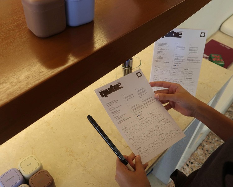
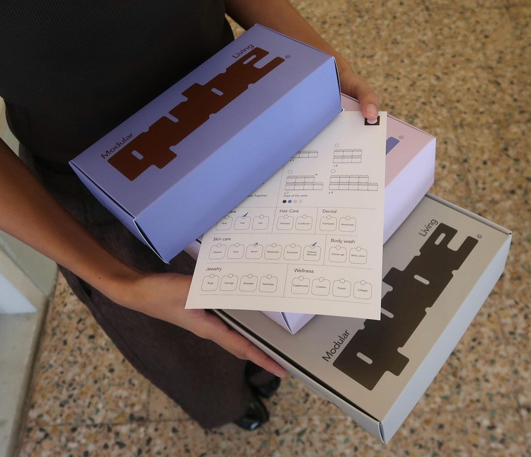
Rooted in the design language of retro instruction manuals, The logotype is built like the product itself, blocky, modular, and engineered to fit. Every curve and cut references the physical interlock of the containers, turning form into function, and storage into style.

Rooted in the design language of retro instruction manuals, The logotype is built like the product itself, blocky, modular, and engineered to fit. Every curve and cut references the physical interlock of the containers, turning form into function, and storage into style.
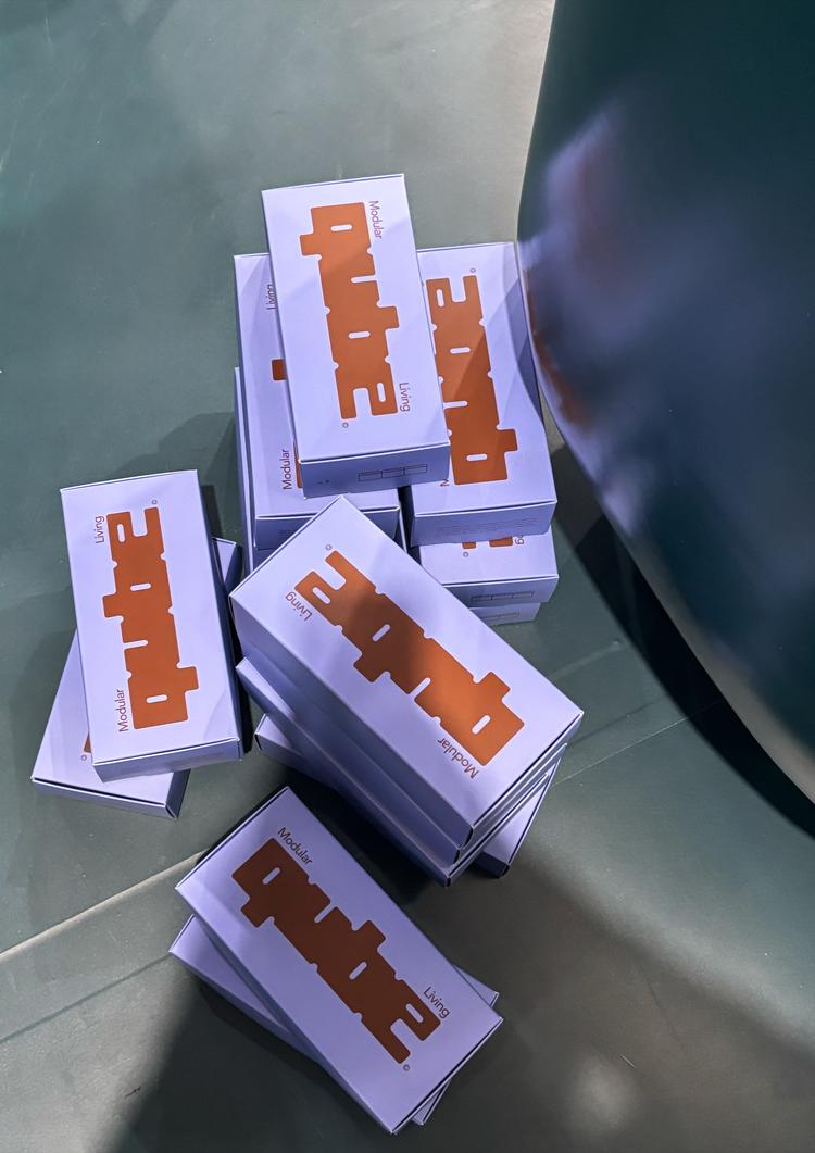
The color palette mirrors the product, soft lilacs, rich browns, and electric blues pulled directly from the material finishes of the containers.

The color palette mirrors the product, soft lilacs, rich browns, and electric blues pulled directly from the material finishes of the containers.

Services

Services

Services

Branding

Branding

Packaging

Packaging

3D Animation

3D Animation

Client

Client

Client

QUBE

QUBE

Year

Year

Year

2025

2025

More

projects