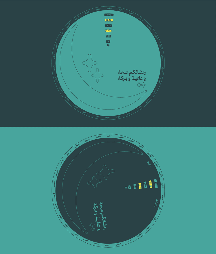
While the visual language aligns with Heal's existing identity, and colours, we designed the calendar through the use of gradient to reference the changing colours of the sky from daylight to dawn, as this is how days are all the days were determined. Embossed crescent and star illustrations add depth and follow Heal’s logo design, creating a restrained tactile finish as the volvelle is handled.