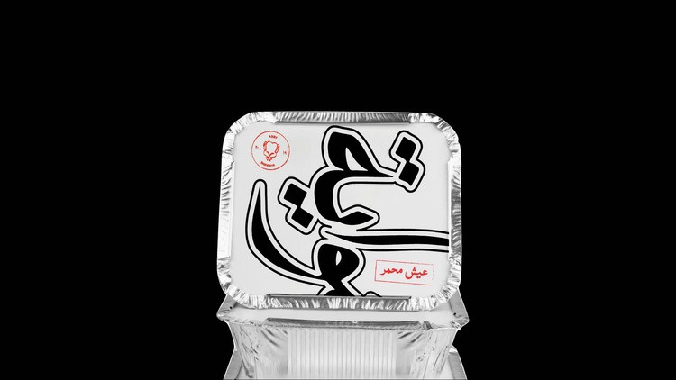
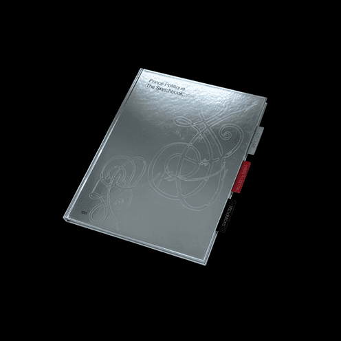
The identity was designed to be fundamentally dynamic, centered around a series of typographic expressions and varied iterations of the CHO name. Rather than a singular, static mark, we developed a fluid visual language that adapts across different touchpoints, allowing the brand to resonate with a diverse consumer base while maintaining a cohesive energy.